Capping Off The Baseball Season
by Craig Colby
Each round of the MLB playoffs is a whirlwind of possibilities, where inches determine outcomes. Predicting winners based on the skills of the players is a great way to be wrong about something. As the author of ALL CAPS: Stories That Justify an Outrageous Hat Collection, I’m picking the winners using a criteria that I believe is just as reliable - which team has the best hats. So here’s a round by round breakdown of the caps that will go to the top.
First Round - American League
Tampa Bay Rays vs Cleveland Guardians
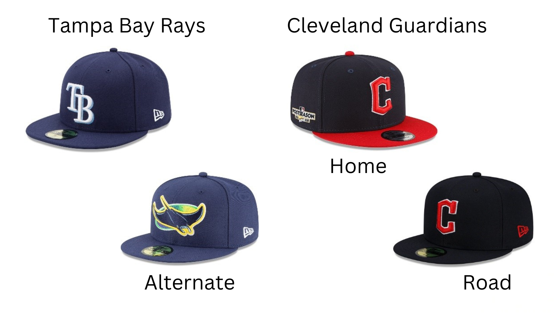
This is a match up of hats that range from pretty good to nope. Tampa Bay has always struggled to find a good lid. Their current official hat, TB in white with a powder drop shadow over a navy field is okay, but uninspired. The letters don’t interact with each other and nothing about it suggests the city’s location. Their alternate hat, a throw back to the Devil Rays design, is a complete miss. There are too many colours, the blue and green fight each other (blue and green should never be seen except inside a washing machine) and the animal logo is a pair of googly eyes away from being a minor league lid. The ray isn’t even in a dramatic pose.
The Guardians, however, have done well with their new design.The C includes the club’s heritage without involving any questionable imagary. A team with this much history has also earned the right to wear a traditional navy and red color scheme. The home hat, with the red brim that matches the letter, is my favourite. The more subdued road hat works too, with the red C giving the cap just enough color. Well done Guardians.
Winner: Cleveland Guardians
Seattle Mariners at Toronto Blue Jays
So many options! This matchup of 1977 expansion cousins is packed with variety. Let’s start wit the visitors.
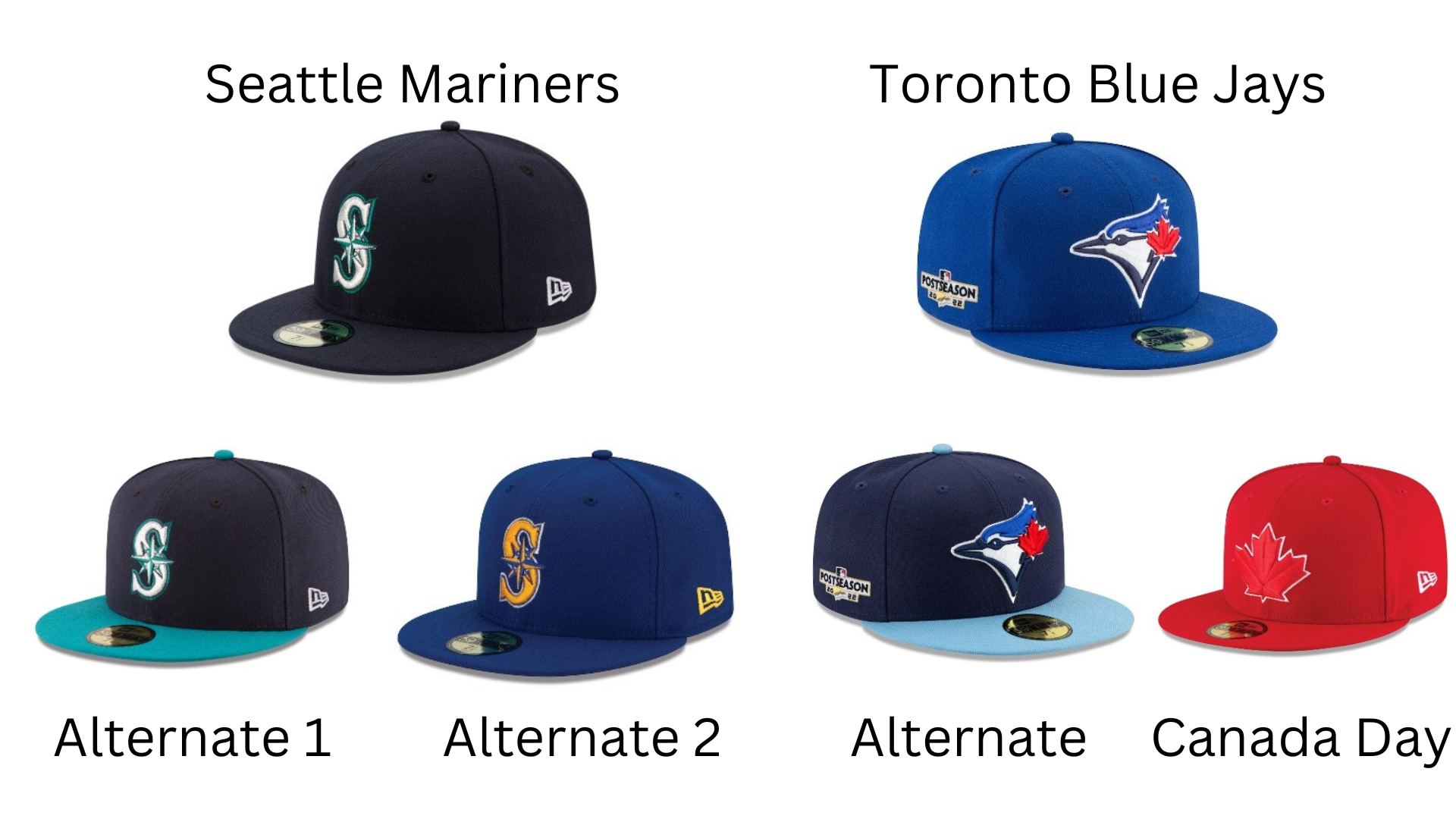
The Mariners have a beautiful home cap, dark blue with the letter S representing the city, in true Major League Baseball fashion, with a Mariner’s compass to tie the cap into the name and region. The teal accent suggests the ocean. Beautiful hat. The alternate, with the teal brim works well too. You wouldn’t want any more teal, a colour that works as seasoning, not as a meal. Their second alternate, however, is where the Mariners lose marks. Going back to the team’s original colors is a nice nod to club history, but passing up the trident M is a big mistake. That classic logo deserves some love.
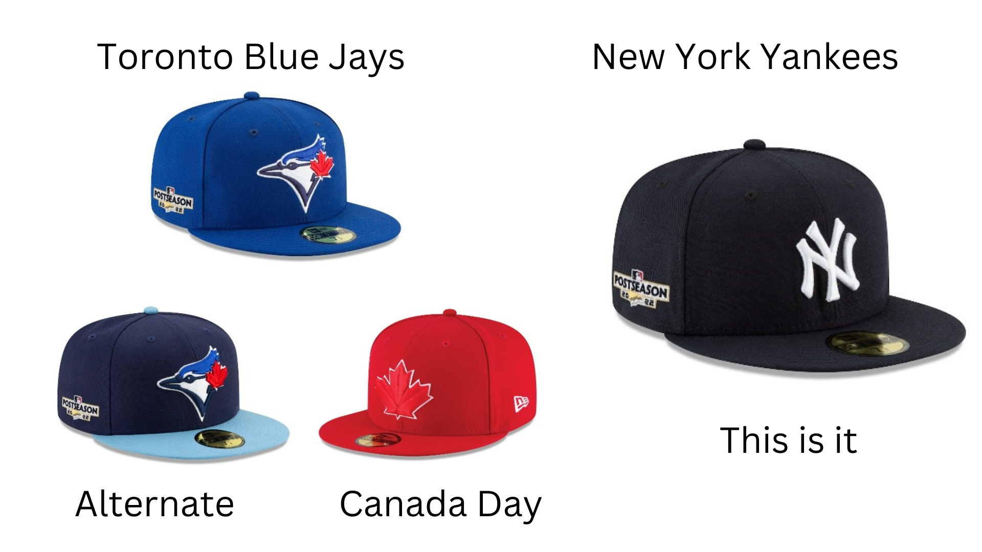
The Blue Jays buck tradition by putting their mascot on their hat rather than a T for Toronto. Doing things different is a great idea for the only team outside the United States and the proud red maple leaf brings that point home in the best possible way. This is one of the most beautiful hats in baseball. The alternate with a navy crown and powder brim is a bold choice, working perfectly with their powder blue alternate uniforms. It’s a popular item among Toronto fans. Giving the alternate a different flavour is a great idea well executed. The Canada Day alternate, worn with red jerseys on July 1 and other special occasions, is an unmistakable statement about this team’s fan base. The Jays aren’t just Toronto’s team, they represent the entire Great White North. The Blue Jays go three for 3-3 with power.
Winner: Toronto Blue Jays
First Round - National League
Philadelphia Phillies at St. Louis Cardinals
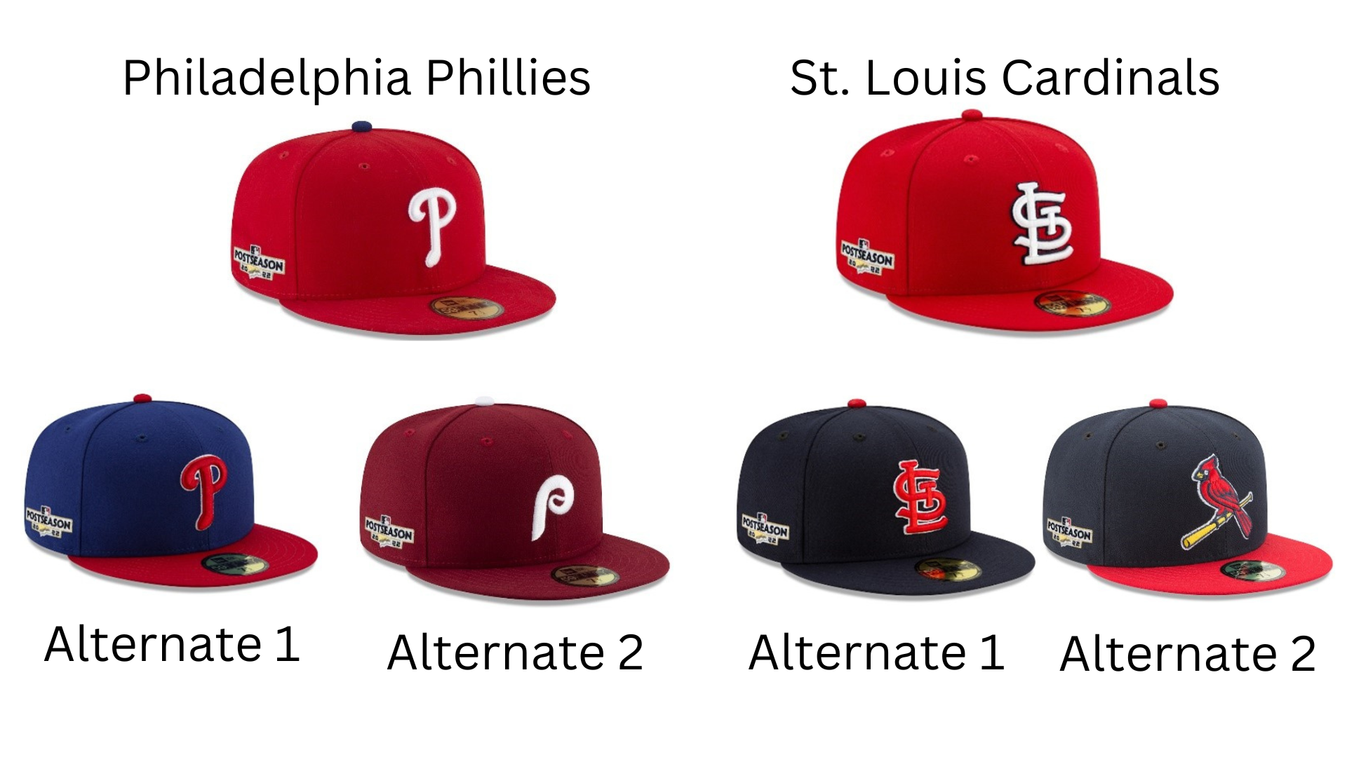
This is a match up for the ages, with two historic teams trotting out a trio of gorgeous lids. Lets start with the Cardinals. Their red standard cap is perfection. The interlocking StL is both stylish and just asymmetrical enough to make it interesting. The dark outline helps the logo stand out. This hat has equals, but no betters. So why does a team whose color scheme is steeped in red have a blue alternate? Because it looks great. Because it’s a traditional baseball color. Because a team this storied can take some liberties. Their second alternate is stunning, a variation of the two-birds-on-a-bat logo from their gorgeous jerseys. Because the hat is smaller, one bird is appropriate. It also centres the cap. Putting the image on a blue background sets off both the tan bat and the red bird. The red brim ties into the bird. Each of these hats is a masterpiece.
The Cardinals have some stiff competition in the Phillies trio of lids. The charming P with the counterweight accent to set off the loop has wonderful symmetry. The white on red looks great, especially in day games. The blue button is a bold choice but Philadelphia is a bold city so that devil-may-care options works. The royal blue alternate really holds together, especially with the white outline around the P. For Phillies fans looking to mix it up, this is an excellent addition to the collection. The third alternate is where things take a left turn for the Phillies but not because there is anything wrong with this hat. There is actually too much right with it. The Phillies cap from the 1970s has a better P, thanks to the subtle baseball stitching inside the loop. It’s also maroon, a color no other team employs and is much better suited to a tough town like Philadelphia. It’s just a better Phillies hat. By making this an alternate, the Phillies have made their most gorgeous friend a bridesmaid. Sorry Phillies, you overshadowed the main event.
Winner: St. Louis Cardinals
San Diego Padres at New York Mets
You’ve got to hand it to the Padres. After years of experimenting with navy and orange, or navy and white, they’ve embraced their unusual heritage. “Our colors are brown and yellow. Does it look like someone spilled mustard on a leisure suit? Maybe a little. Does it matter? No, it doesn’t. This is who we are. Deal with it.”
The interlocking SD looks nice, although I don’t understand why there is a break in the D. I’m glad they went with a solid front rather than the yellow panel. The hat somehow looks both unusual and traditional. It’s a solid lid. The alternate is a little blah. I can’t see what the bland SD adds, other than perhaps matching slightly better with their camo alternate jerseys. I don’t like it. Then there’s the City Connect monstrosity. This whole campaign has been a huge disaster. The hat is fine as a fashion cap, if you like that sort of thing, but it should never be seen on a major league field. Not cool, Padres, not cool.
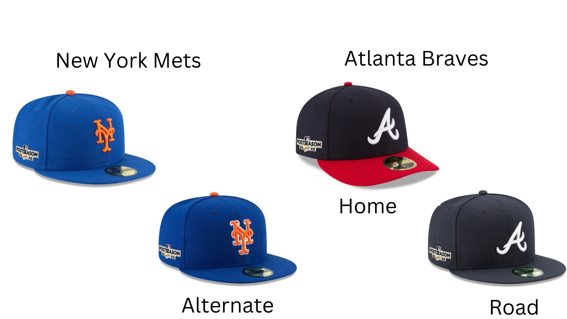
The Mets cap is wonderful. Royal and orange go well together and are a perfect nod to long-gone New York teams, the Dodgers and Giants. I love this cap. I’m flummoxed by the alternate. The only difference is a white outline? Why bother? Still, they didn’t stoop to a City Connect hat.
Winner: New York Mets
Second Round - American League
Toronto Blue Jays vs Houston Astros
The Astros have solid hats with a star that references both the city’s NASA connection and its lone star state status. Navy with orange is always a great combination. The road hat’s orange brim option adds a little more colour. Fans can wear this when they want to go brighter. The orange top alternate is okay, but the lighter blue on the star feels unmotivated. Then there’s the City Connect hat. Just.. no. From the sidde patch that looks like someone slapped on a sticker, to the line drawing orbit and star, which feels very grade school art class, to the airbrushed orange-to-yellow color scheme, this hat is a disaster. The Astros hats have a major flaw – they’re still tainted by the association with the cheating scandal in the 2017 World Series. Also, one too many hats.
The Jays strong trio of hats is too much for the Astros to handle.
Winner: Toronto Blue Jays
New York Yankees vs. Cleveland Guardians
The New York Yankees don’t have a road hat, an alternate hat, or a City Connect hat. They have the New York Yankees hat. It’s an iconic, perfect symbol of baseball and America. The majestically symmetrical interlocking NY on a sea of midnight cannot be improved upon. If you want to buy a red fashion hat, or maybe a baby blue Father’s Day hat, go ahead. The Yankees will be wearing this on the field, as they should.
Winner: New York Yankees
Second Round - National League
St. Louis Cardinals vs Los Angeles Dodgers
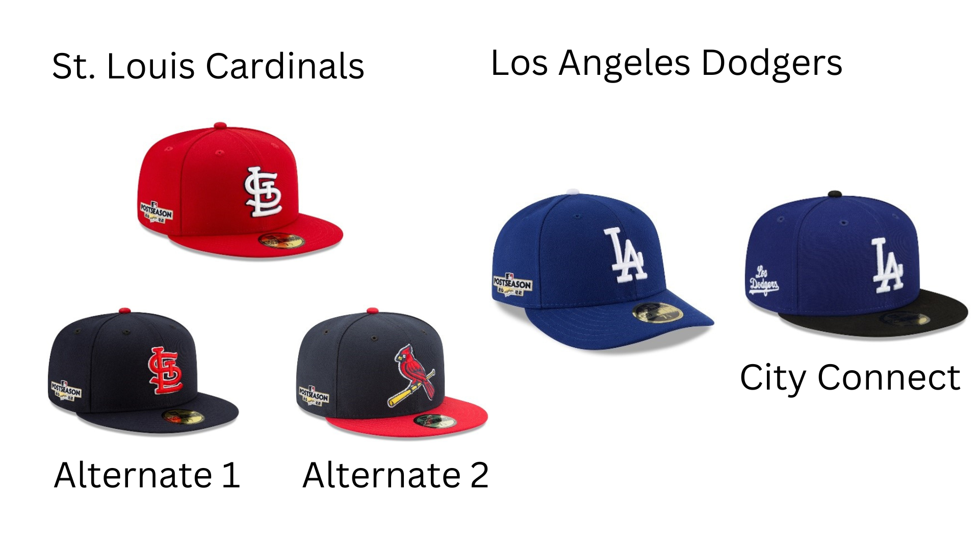
The Dodgers are another team with unimpeachable traditional hats. The simple but effective interlocking LA in crisp white on a royal background is a classy classic. It’s both bright and warm, perfect for southern California. The white button is the cherry on top. This is one of the A+ lids in MLB. Unfortunately, the Dodgers decided to create a City Connect uniform. Last year, they wrote “Los Dodgers” across the front in script, which looked like a souvenir shop cap. This year, they improved the hat by restoring the LA, but with a black brim, putting “Los Dodgers” on the side. The black brim is an echo of the embarrassing “kids like black” sensibility popular in the 1990s. It smelled of desperation marketing then and doesn’t feel any better now. A black brim makes no sense on a Dodgers hat. The design has all the originality of a high school student doing his assignment at the last minute on the bus to school. Total failure. This would have been an epic showdown without the City Connect cap. Now it’s a blowout.
Winner: St. Louis Cardinals
New York Mets vs Atlanta Braves
The Atlanta Braves home cap doesn’t get enough credit. Whatever you feel about the graphics on their jerseys (I don’t like them), the hats are gorgeous. The red brim and button with a navy cap and white A that appears to wave like a weeping willow is sublime, the perfect blend of American colors and understated style. This is a great hat. The road hat is a little lackluster. I get it. You don’t want to be showy on the road. Let the home team get all the attention. Also, you want to be able to give the fans another hat option. It just falls flat next to the home hat. I know that seems unfair because they are doing exactly what works spectaculary for the Yankees and Tigers. I don’t think this A, although lovely, is a strong enough design to pull it off.
This is a tough call. Both teams have fantastic home hats with a lackluster second lid. The Mets lazy white outline on the NY is a decision so puzzling it tips the scales.
Winner: Atlanta Braves
American League Champsionship Series
Toronto Blue Jays vs. New York Yankees
This is a great showdown. The iconic Yankees cap against the Jays trio of upstarts. The Jays have done a wonderful job of providing three different and effective looks with their caps but there’s just no way they can overcome the history and class of this Bronx beauty.
Winner: New York Yankees
National League Championship Series
St. Louis Cardinals vs. Atlanta Braves
This is a mismatch. The Cardinals can roll out three caps that not only trounce the Braves’ road cap, they beat Atlanta’s home cap too.
Winner: St. Louis Cardinals.
World Series
St. Louis Cardinals vs. New York Yankees
This showdown is as good as it gets on several levels. Not only do you have two of most time-honored caps facing off, but you also have the contrast of bright red vs dark blue. Then there is the biggest issue: are three stunning caps better than one? The Yankees stand firm with their American classic. And why not? Why would you mess with a legend? The Cardinals could have done exactly the same thing. Their red Cardinal cap is almost as storied. The Yankees have the most World Series wins, but the Cardinals are second. Still, when the Cardinals decided to introduce other hats, they provided caps that felt like they belonged with the beloved home cap. For me that tips the scales to the Cardinals. It takes courage to mess with a legend. It takes skill to make it work.
Winner: St. Louis Cardinals
Craig Colby is a television executive producer, producer, director, writer and story editor. He runs a storytelling consulting and production service. Craig is also the author of the Canadian Book Club Award Finalist ALL CAPS: Stories That Justify an Outrageous Hat Collection.


